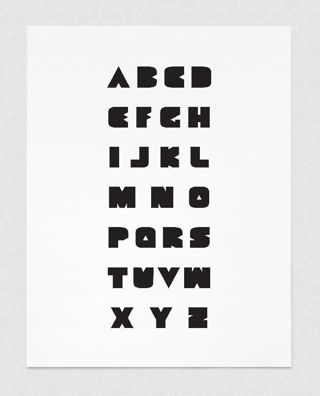
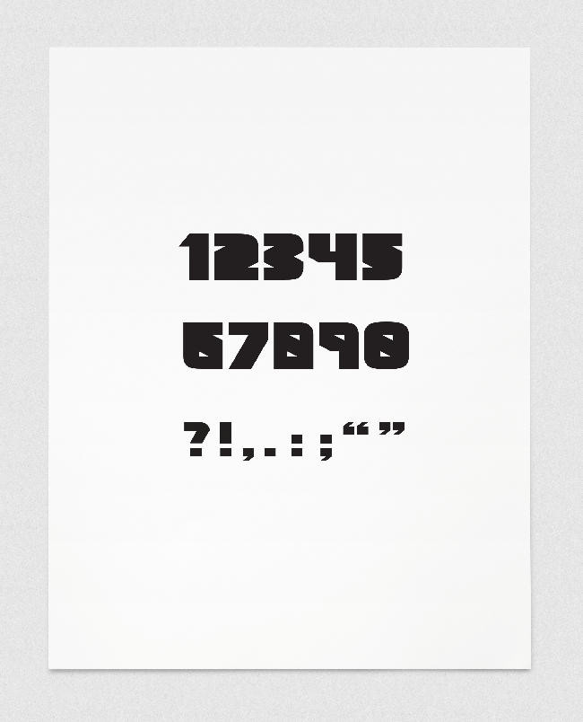
GEOMETRIC BLACK is a heavy weight font, designed specifically for screen. The influences for this font were old Russian propaganda posters, and thus the font was designed with the intention of recreating a similar style, though for use on the screen. These influences, as well as the design of it's heavy weight glyphs aim to produce a powerful visual impact.
Geometric Black is available for download from www.dafont.com
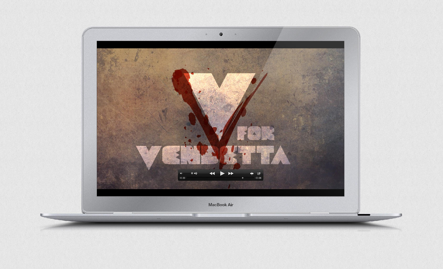
The first application of GEOMETRIC BLACK is the opening title sequence for V for Vendetta, created in an old rustic Russian propaganda style for a Typography for Screen class.
These opening credits made use of Adobe After Effects. Through this class I discovered a passion for typography for screen animation, and will be sure to develop my After Effects skills in the future.
Please feel free to watch the video of the opening title sequence for V for Vendetta, above.
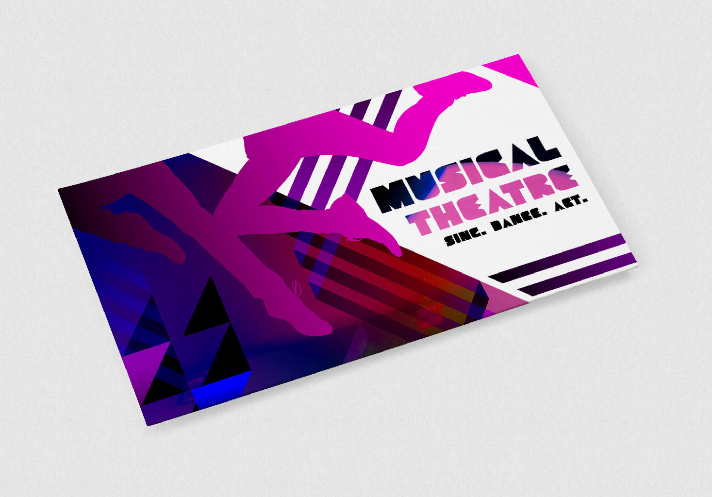
The second application of GEOMETRIC BLACK is a postcard designed for the Musical Theatre program at Conservatorium, Griffith University, Brisbane, Australia.
The brief was to make heavy use of geometric line and shape, active and interesting colour, and visual movement to produce an aesthetically interesting outcome. The use of GEOMETRIC BLACK as the postcard font fit perfectly with the visual style.
This second application of GEOMETRIC BLACK demonstrates the versatility and flexibility of the font.