In 2016, the Arizona Lee & Associates office celebrated 25 years of business. To recognise this achievement, I worked with the design team at Small Giants to create a commemorative 25th anniversary logo. The design had to build on the current Lee & Associates logo and corporate design guidelines, and be legible for all standard marketing uses.
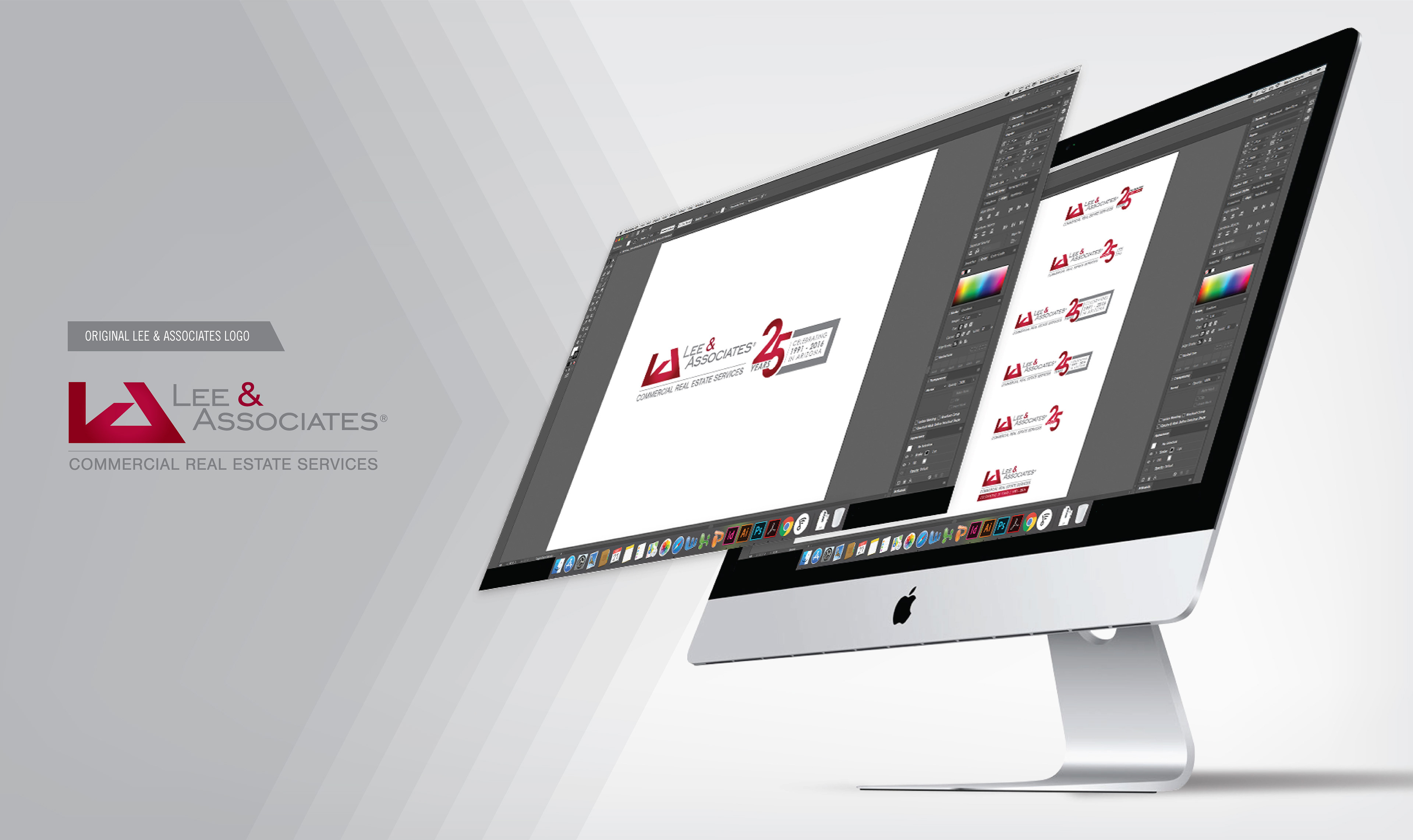
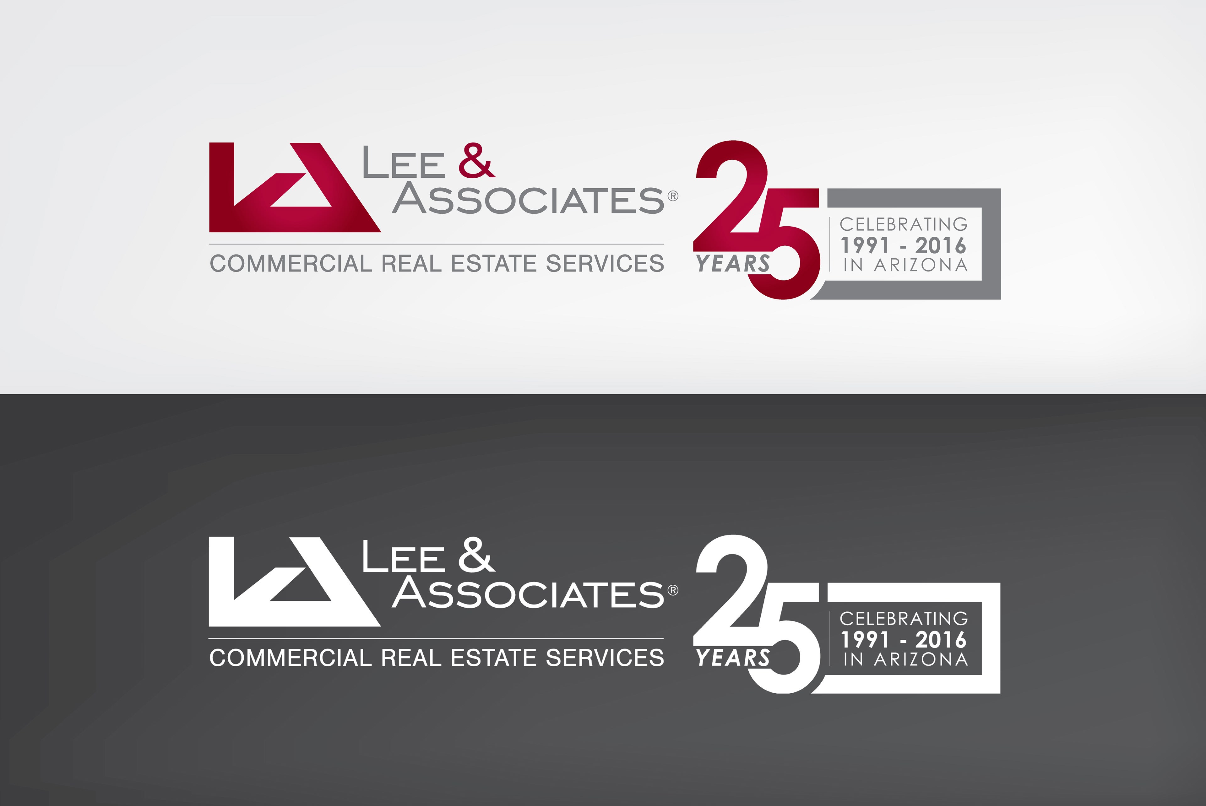
Several variations of the logo were created. These then went through many rounds of development and eventually one outcome was approved from the board of brokers. This logo was implemented for an entire year, used on all marketing materials, including email campaigns, brochures, and email signatures.
In 2017, local marketing agency, Small Giants re-designed the Lee & Associates company logo and the brand was updated for use across the 50+ offices nationwide. Our Arizona office and graphics department took large involvement in the process, working with Small Giants, through the process.

The logo design was altered from sharp corners and diagonal lines to a modern aesthetic of smooth flowing curves. This change of design style was then implemented through all aspects of the Lee & Associates brand.
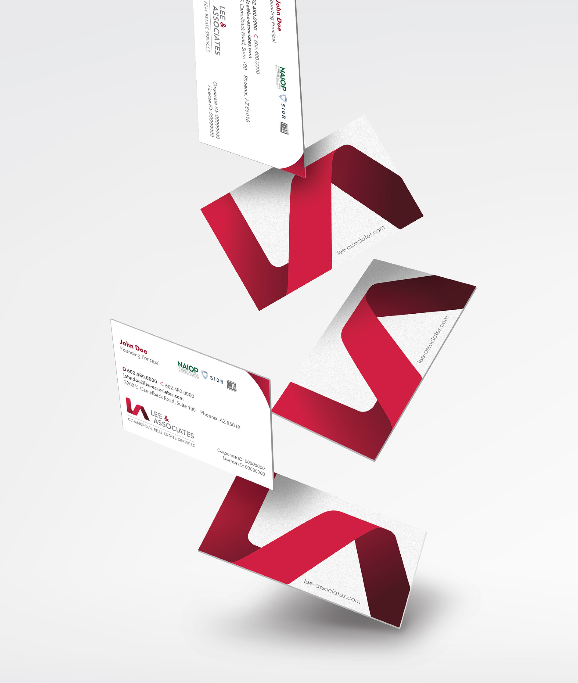
Business cards. These were designed in both portrait and landscape variations for broker preference.

A variety of marketing materials were designed consistent to the new brand style. A few samples can be seen above, including letterhead, covers, and brochure templates.
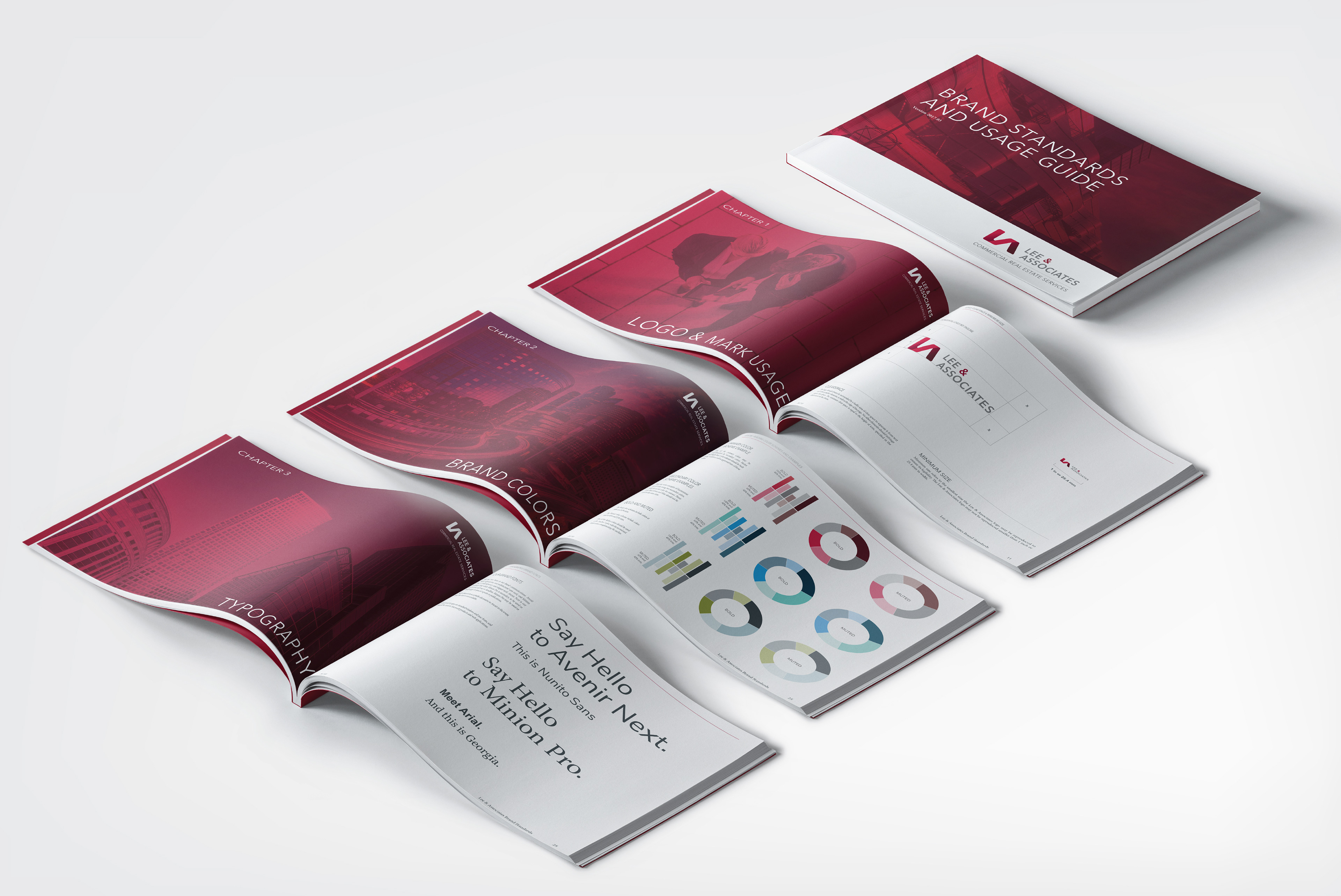
A brand style guide was implemented and send nationwide to ensure all offices followed a consistent brand aesthetic and strict design rules.
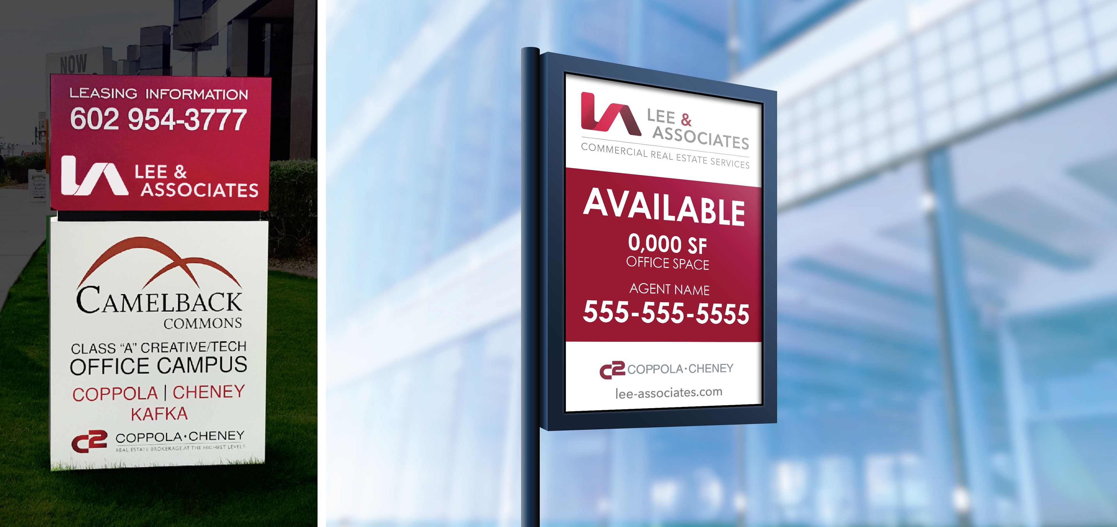
A variety of template signage options were created to fulfil all broker needs. A strict guideline was also outlined for custom signage creation, simply to ensure brand consistency over all mediums.